18. Matplotlib: グラフの描画#
import matplotlib.pyplot as plt
import numpy as np
18.1. プロット#
# 2019年の東京の最高気温 (h) と最低気温 (l) の月ごとの平均
X = [1, 2, 3, 4, 5, 6, 7, 8, 9, 10, 11, 12]
H = [10.3,11.6,15.4,19.0,25.3,25.8,27.5,32.8,29.4,23.3,17.7,12.6]
L = [1.4,3.3,6.2,9.2,15.3,18.5,21.6,25.2,21.7,16.4,9.3,5.2]
Matplotlibを利用する上で基本となるオブジェクトは以下の3つ。
plt: matplotlib.pyplotモジュールの別名(慣習でpltがよく用いられる)fig: グラフ全体を管理するFigureオブジェクトax: ひとつのプロットエリアを管理するAxesオブジェクト
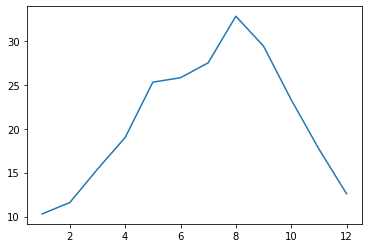
axオブジェクトのplot関数に横軸と縦軸の値を渡すとプロットされる。デフォルトでは、各点が実線で結ばれる。
fig, ax = plt.subplots()
ax.plot(X, H)
plt.show()
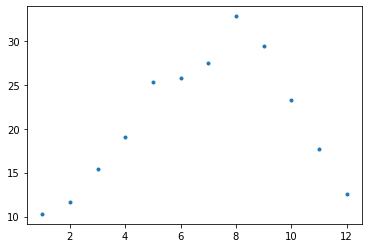
plot関数の第3引数(fmtキーワード)に'.'を指定すると、データが点としてプロットされる(マーカーとして「点」を指定したことに相当する)。
fig, ax = plt.subplots()
ax.plot(X, H, '.')
plt.show()
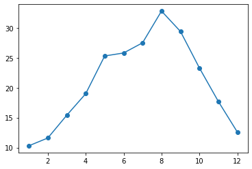
plot関数の第3引数(fmtキーワード)に'o-'を指定すると、データが大きめの丸としてプロットされ、その間が線で結ばれる(マーカーとして「丸」、線として「実線」を指定したことに相当する)。
fig, ax = plt.subplots()
ax.plot(X, H, 'o-')
plt.show()
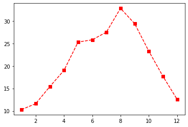
点を四角(s)、線を破線(--)、色を赤(r)でプロットする例。plot関数の第3引数(fmtキーワード)はマーカー、線、色の順番で指定する。。
fig, ax = plt.subplots()
ax.plot(X, H, 's--r')
plt.show()
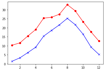
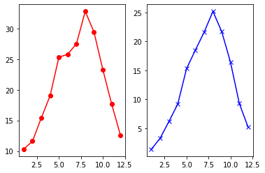
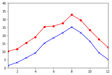
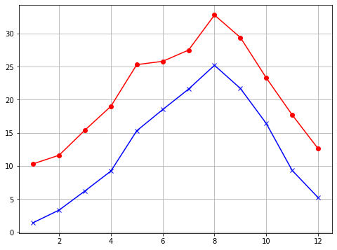
最高気温(H)と最低気温(L)をひとつの領域にプロットする例。
fig, ax = plt.subplots()
ax.plot(X, H, 'o-r')
ax.plot(X, L, 'x-b')
plt.show()
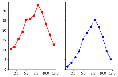
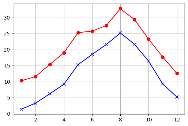
fmt引数の代わりに、マーカーをmarker引数、線スタイルをls引数、色をcolor引数で指定する例。指定できるマーカー、線スタイル、色はドキュメントを参照のこと。lsキーワード引数はlinestyleキーワード引数の省略形である。
fig, ax = plt.subplots()
ax.plot(X, H, marker='o', ls='-', color='r')
ax.plot(X, L, marker='x', ls='-', color='b')
plt.show()
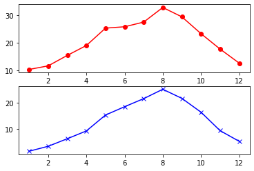
subplots関数の引数でグラフを2つのプロットエリアに縦に分割し、最高気温と最低気温をプロットする例。
fig, (ax1, ax2) = plt.subplots(2, 1)
ax1.plot(X, H, 'o-r')
ax2.plot(X, L, 'x-b')
plt.show()
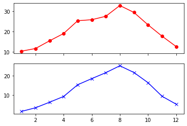
グラフを2つのプロットエリアに縦に分割したとき、横軸を共有する例。
fig, (ax1, ax2) = plt.subplots(2, 1, sharex=True)
ax1.plot(X, H, 'o-r')
ax2.plot(X, L, 'x-b')
plt.show()
グラフを2つのプロットエリアに横に分割し、最高気温と最低気温をプロットする例。
fig, (ax1, ax2) = plt.subplots(1, 2)
ax1.plot(X, H, 'o-r')
ax2.plot(X, L, 'x-b')
plt.show()
グラフを2つのプロットエリアに横に分割したとき、縦軸を共有する例。
fig, (ax1, ax2) = plt.subplots(1, 2, sharey=True)
ax1.plot(X, H, 's-r')
ax2.plot(X, L, 'o--b')
plt.show()
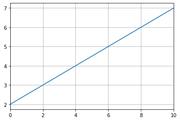
plot関数で直線 \(y = 0.5x + 2\) を描画する例(2つの点 \((0, 2), (10, 7)\) を直線で結ぶ)。
fig, ax = plt.subplots()
x = np.array([0, 10])
ax.plot(x, 0.5 * x + 2, '-')
ax.set_xlim(x)
ax.grid()
plt.show()
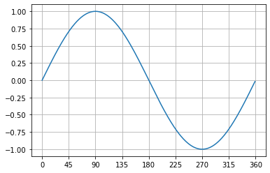
plot関数で正弦関数(\(\sin\))の軌跡をプロットする例。
t = np.arange(0, 360, 1)
s = np.sin(2 * np.pi * (t / 360))

fig, ax = plt.subplots()
ax.plot(t, s)
ax.grid()
ax.xaxis.set_ticks(np.arange(0, 400, 45))
plt.show()
グラフをファイルに保存する。
fig.savefig('graph.png')
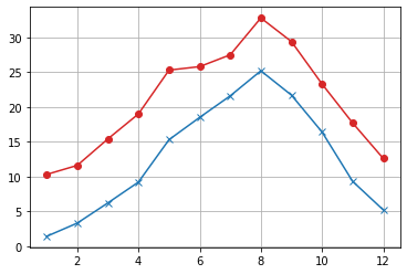
18.2. 軸やラベルの設定・変更#
何も設定していないグラフ。
fig, ax = plt.subplots()
ax.plot(X, H, 'o-r')
ax.plot(X, L, 'x-b')
plt.show()
set_xlim関数とset_ylim関数で、横軸と縦軸の範囲を指定。
fig, ax = plt.subplots()
ax.plot(X, H, 'o-r')
ax.plot(X, L, 'x-b')
ax.set_xlim(1, 12)
ax.set_ylim(0, 40)
plt.show()
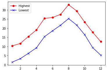
plot関数のlabel引数と、legend関数で凡例を表示(凡例の表示位置は、legend関数のloc引数で制御できる)。
fig, ax = plt.subplots()
ax.plot(X, H, 'ro-', label="Highest")
ax.plot(X, L, 'bx-', label="Lowest")
ax.legend(loc='upper left')
plt.show()
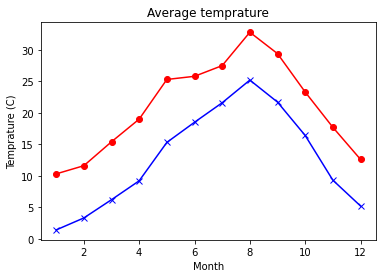
set_title関数、set_xlabel関数、set_ylabel関数を用いて、グラフや軸のタイトルを表示。
fig, ax = plt.subplots()
ax.plot(X, H, 'o-r')
ax.plot(X, L, 'x-b')
ax.set_title('Average temprature')
ax.set_xlabel('Month')
ax.set_ylabel('Temprature (C)')
plt.show()
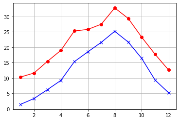
grid関数でグリッドを表示。
fig, ax = plt.subplots()
ax.plot(X, H, 'o-r')
ax.plot(X, L, 'x-b')
ax.grid()
plt.show()
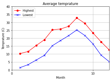
全てを指定してグラフを完成させたバージョン(xaxis.set_ticks関数で横軸のグリッドの幅を設定)。
fig, ax = plt.subplots()
ax.plot(X, H, 'ro-', label="Highest")
ax.plot(X, L, 'bx-', label="Lowest")
ax.legend(loc='upper left')
ax.set_xlim(1, 12)
ax.set_ylim(0, 40)
ax.set_title('Average temprature')
ax.set_xlabel('Month')
ax.set_ylabel('Temprature (C)')
ax.xaxis.set_ticks(x)
ax.grid()
plt.show()
18.3. グラフの装飾#
グラフのサイズ(figsize)の変更(サイズ指定の単位はインチ)。
fig, ax = plt.subplots(figsize=(8, 6))
ax.plot(X, H, 'o-r')
ax.plot(X, L, 'x-b')
ax.grid()
plt.show()
グラフの解像度(dpi)を変更してグラフを拡大。
fig, ax = plt.subplots(dpi=120)
ax.plot(X, H, 'o-r')
ax.plot(X, L, 'x-b')
ax.grid()
plt.show()
matplotlibでデフォルトで用いられるパレットの色(tab color)を指定する例。
fig, ax = plt.subplots()
ax.plot(X, H, 'o-', color='tab:red')
ax.plot(X, L, 'x-', color='tab:blue')
ax.grid()
plt.show()
線の太さ(lw)を指定する例。なお、lwキーワード引数はlinewidthキーワード引数の省略形である。
fig, ax = plt.subplots()
ax.plot(X, H, 'o-', lw=2, color='tab:red')
ax.plot(X, L, 'x-', lw=0.5, color='tab:blue')
ax.grid()
plt.show()
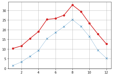
axhline関数で水平な補助線を描画する例。
fig, ax = plt.subplots()
ax.plot(X, H, 'o-', color='tab:red')
ax.plot(X, L, 'x-', color='tab:blue')
ax.axhline(30, color='tab:brown', ls='--')
ax.axhline(10, color='tab:green', ls='--')
ax.grid()
plt.show()
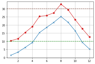
axvline関数で垂直な補助線を描画する例
fig, ax = plt.subplots()
ax.plot(X, H, 'o-', color='tab:red')
ax.plot(X, L, 'x-', color='tab:blue')
ax.axvline(4, color='tab:orange', ls=':')
ax.axvline(10, color='tab:orange', ls=':')
ax.grid()
plt.show()
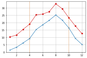
fill_between関数で2つの系列データの間を塗りつぶす例。
fig, ax = plt.subplots()
ax.fill_between(X, L, H)
ax.grid()
plt.show()
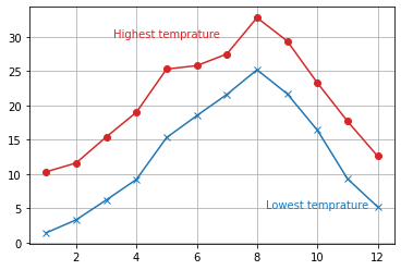
text関数で座標を指定してテキストを書き込む例(ha='center'は指定された横軸の位置が中心になるように調整する)。
fig, ax = plt.subplots()
ax.plot(X, H, 'o-', color='tab:red')
ax.plot(X, L, 'x-', color='tab:blue')
ax.text(5, 30, 'Highest temprature', ha='center', color='tab:red')
ax.text(10, 5, 'Lowest temprature', ha='center', color='tab:blue')
ax.grid()
plt.show()
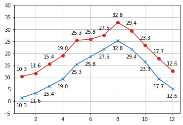
annotate関数でプロットされる値を書き込む例。
fig, ax = plt.subplots()
ax.plot(X, H, 'o-', color='tab:red')
ax.plot(X, L, 'x-', color='tab:blue')
for x, hi, lo in zip(X, H, L):
    hs = f'{hi:.1f}'
    ls = f'{lo:.1f}'
    ax.annotate(hs, (x, hi), textcoords='offset points', xytext=(0,10), ha='center', va='bottom')
    ax.annotate(hs, (x, lo), textcoords='offset points', xytext=(0,-10), ha='center', va='top')
ax.set_ylim(-5, 40)
ax.grid()
plt.show()
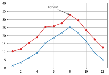
annotate関数で指定された位置に矢印を描画し、その起点にテキストを書き込む例。
fig, ax = plt.subplots()
ax.plot(X, H, 'o-', color='tab:red')
ax.plot(X, L, 'x-', color='tab:blue')
ax.annotate(
    'Highest', xy=(8, H[7]), textcoords='offset points', xytext=(-40, 20),
    ha='right', va='bottom', arrowprops=dict(arrowstyle='->'))
ax.set_ylim(0, 40)
ax.grid()
plt.show()
18.4. 棒グラフ#
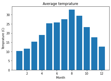
bar関数で棒グラフを描画。
fig, ax = plt.subplots()
ax.bar(X, H)
ax.set_title('Average temprature')
ax.set_xlabel('Month')
ax.set_ylabel('Temprature (C)')
plt.show()
横軸の値のラベルを指定し、月名を表示する。
months = ['Jan', 'Feb', 'Mar', 'Apr', 'May', 'Jun', 'Jul', 'Aug', 'Sep', 'Oct', 'Nov', 'Dec']
fig, ax = plt.subplots()
ax.bar(X, H, tick_label=months)
ax.set_title('Average temprature')
ax.set_xlabel('Month')
ax.set_ylabel('Temprature (C)')
plt.show()

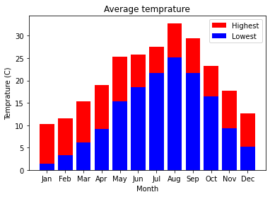
bar関数を繰り返し用い、積み上げ棒グラフを描画。
fig, ax = plt.subplots()
ax.bar(X, H, color="r", label="Highest")
ax.bar(X, L, color="b", label="Lowest", tick_label=months)
ax.legend()
ax.set_title('Average temprature')
ax.set_xlabel('Month')
ax.set_ylabel('Temprature (C)')
plt.show()
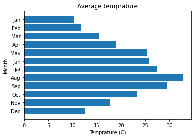
barh関数を用いて、水平方向の棒グラフを描画。以下のコードでinvert_yaxis関数を呼び出さないと、月が下から上の方向に並ぶ。
fig, ax = plt.subplots()
ax.barh(X, H, tick_label=months)
ax.invert_yaxis() # Arange labels top to bottom.
ax.set_title('Average temprature')
ax.set_xlabel('Temprature (C)')
ax.set_ylabel('Month')
plt.show()
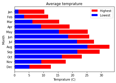
barh関数を繰り返し用い、積み上げ棒グラフを描画。
fig, ax = plt.subplots()
ax.barh(X, H, color="r", label="Highest")
ax.barh(X, L, color="b", label="Lowest", tick_label=months)
ax.legend()
ax.invert_yaxis()
ax.set_title('Average temprature')
ax.set_xlabel('Temprature (C)')
ax.set_ylabel('Month')
plt.show()
18.5. 散布図#
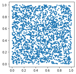
2次元平面上で、\(0 \leq x < 1 \wedge 0 \leq y < 1\)の範囲内でランダムな点を2000個作成し、\(d\)に格納する。
D = np.random.rand(2, 2000)
scatter関数を呼び出し、2次元平面上で\(d\)を散布図として描く(今回はset_aspect関数で縦横比を1:1にしておく)。
fig, ax = plt.subplots()
ax.scatter(D[0], D[1], marker='.')
ax.set_aspect('equal')
plt.show()
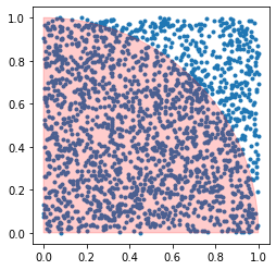
patches.Wedgeクラスを用いて円弧(中心座標は\((0,0)\)、半径は\(1\)、角度の範囲は0度から90度、alpha引数で透明度を指定)を描き、グラフの上に重ねる。
import matplotlib.patches

fig, ax = plt.subplots()
ax.scatter(D[0], D[1], marker='.')
ax.set_aspect('equal')
circle = matplotlib.patches.Wedge((0, 0), 1, 0, 90, alpha=0.2, color='r')
ax.add_patch(circle)
plt.show()
18.6. 2次元メッシュ・等高線#
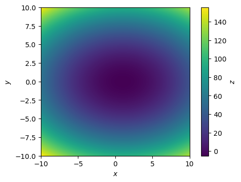
\(z = 0.5 (x - 1)^2 + y^2 - 20\)に対して、pcolormesh関数で2次元メッシュを描画する例。
xmin, xmax = -10, 10
ymin, ymax = -10, 10
N = 1000
XX, YY = np.meshgrid(np.linspace(xmin, xmax, N), np.linspace(ymin, ymax, N))
ZZ = 0.5 * (XX - 1) ** 2 + YY ** 2 - 5

fig, ax = plt.subplots(dpi=100)
ax.set_aspect('equal')
ax.set_xlabel('$x$')
ax.set_ylabel('$y$')
mesh = ax.pcolormesh(XX, YY, ZZ, shading='auto')
cbar = fig.colorbar(mesh)
cbar.set_label('$z$')
plt.show()
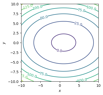
\(z = 0.5 (x - 1)^2 + y^2 - 20\)に対して、contour関数で等高線を描画する例。
xmin, xmax = -10, 10
ymin, ymax = -10, 10
N = 1000
XX, YY = np.meshgrid(np.linspace(xmin, xmax, N), np.linspace(ymin, ymax, N))
ZZ = 0.5 * (XX - 1) ** 2 + YY ** 2 - 5

fig, ax = plt.subplots(dpi=100)
ax.set_aspect('equal')
ax.set_xlabel('$x$')
ax.set_ylabel('$y$')
cont = ax.contour(XX, YY, ZZ)
cont.clabel(fmt='%1.1f')
plt.show()
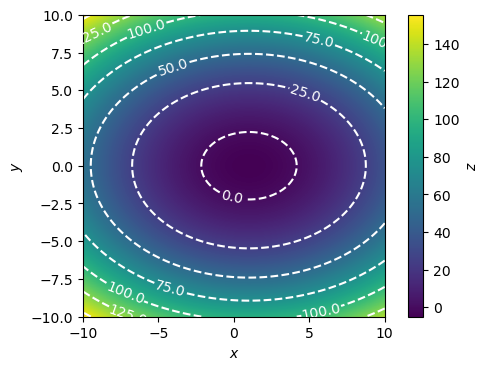
\(z = 0.5 (x - 1)^2 + y^2 - 20\)に対して、2次元メッシュと等高線を描画する例。
xmin, xmax = -10, 10
ymin, ymax = -10, 10
N = 1000
XX, YY = np.meshgrid(np.linspace(xmin, xmax, N), np.linspace(ymin, ymax, N))
ZZ = 0.5 * (XX - 1) ** 2 + YY ** 2 - 5

fig, ax = plt.subplots(dpi=100)
ax.set_aspect('equal')
ax.set_xlabel('$x$')
ax.set_ylabel('$y$')
mesh = ax.pcolormesh(XX, YY, ZZ, shading='auto')
cbar = fig.colorbar(mesh)
cbar.set_label('$z$')
cont = ax.contour(XX, YY, ZZ, colors='white', linestyles='dashed')
cont.clabel(fmt='%1.1f')
plt.show()
18.7. アニメーション#
import matplotlib.animation
from IPython.display import HTML
ArtistAnimation関数でアニメーションを作成する例。各コマで描画すべきArtistオブジェクトの集合を要素としたリストを作成し、ArtistAnimation関数に渡す。ArtistオブジェクトについてはArtist tutorialを参照のこと。
D = np.random.rand(2, 100)
C = np.where(D[0] ** 2 + D[1] ** 2 <= 1, 'r', 'b')

fig, ax = plt.subplots()
ax.set_aspect('equal')
ax.set_xlim(0, 1)
ax.set_ylim(0, 1)
circle = matplotlib.patches.Wedge((0, 0), 1, 0, 90, alpha=0.2, color='r')
ax.add_patch(circle)

artists = []
for t in range(D.shape[1]):
    A = []
    A.append(ax.scatter(D[0,:t], D[1,:t], color=C[:t], marker='.'))
    artists.append(A)

ani = matplotlib.animation.ArtistAnimation(fig, artists, interval=10)
html = ani.to_jshtml()
plt.close(fig)
HTML(html)
FuncAnimation関数でアニメーションを作成する例。プロットエリアの初期化と更新を行う関数を実装し、FuncAnimation関数の引数として渡す。
D = np.random.rand(100, 2)

fig, ax = plt.subplots()
ax.set_aspect('equal')
ax.set_xlim(0, 1)
ax.set_ylim(0, 1)

def init():
    circle = matplotlib.patches.Wedge((0, 0), 1, 0, 90, alpha=0.2, color='r')
    return [ax.add_patch(circle),]

def update(d):
    x, y = d
    c = 'r' if x ** 2 + y ** 2 < 1 else 'b'
    return [ax.scatter(x, y, marker='.', color=c),]

ani = matplotlib.animation.FuncAnimation(fig, update, D, init, interval=10, blit=True)
plt.close(fig)
HTML(ani.to_jshtml())
18.8. 日本語の表示方法#
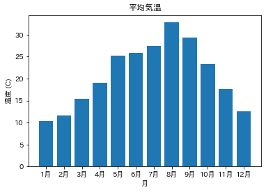
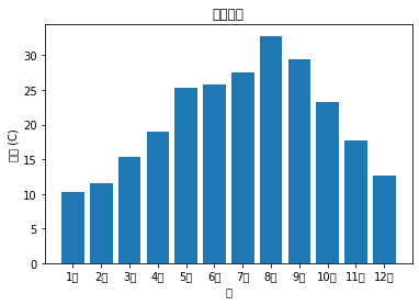
月の名前を日本語表記に変更する。
months = [f'{x}月' for x in X]
months
['1月', '2月', '3月', '4月', '5月', '6月', '7月', '8月', '9月', '10月', '11月', '12月']
また、グラフや軸の名前に日本語を使うと、以下のような文字化けが発生する。
fig, ax = plt.subplots()
ax.bar(X, H, tick_label=months)
ax.set_title('平均気温')
ax.set_xlabel('月')
ax.set_ylabel('温度 (C)')
plt.show()
/usr/lib/python3/dist-packages/IPython/core/pylabtools.py:151: UserWarning: Glyph 24179 (\N{CJK UNIFIED IDEOGRAPH-5E73}) missing from current font.
  fig.canvas.print_figure(bytes_io, **kw)
/usr/lib/python3/dist-packages/IPython/core/pylabtools.py:151: UserWarning: Glyph 22343 (\N{CJK UNIFIED IDEOGRAPH-5747}) missing from current font.
  fig.canvas.print_figure(bytes_io, **kw)
/usr/lib/python3/dist-packages/IPython/core/pylabtools.py:151: UserWarning: Glyph 27671 (\N{CJK UNIFIED IDEOGRAPH-6C17}) missing from current font.
  fig.canvas.print_figure(bytes_io, **kw)
/usr/lib/python3/dist-packages/IPython/core/pylabtools.py:151: UserWarning: Glyph 28201 (\N{CJK UNIFIED IDEOGRAPH-6E29}) missing from current font.
  fig.canvas.print_figure(bytes_io, **kw)
/usr/lib/python3/dist-packages/IPython/core/pylabtools.py:151: UserWarning: Glyph 26376 (\N{CJK UNIFIED IDEOGRAPH-6708}) missing from current font.
  fig.canvas.print_figure(bytes_io, **kw)
/usr/lib/python3/dist-packages/IPython/core/pylabtools.py:151: UserWarning: Glyph 24230 (\N{CJK UNIFIED IDEOGRAPH-5EA6}) missing from current font.
  fig.canvas.print_figure(bytes_io, **kw)
この問題に対処するには、japanize-matplotlibモジュールをインストールし、japanize_matplotlibをインポートすればよい(モジュールをインポートするときに"-"が"_"に置き換わることに注意)
!pip install japanize-matplotlib
Defaulting to user installation because normal site-packages is not writeable
Requirement already satisfied: japanize-matplotlib in /home/okazaki/.local/lib/python3.10/site-packages (1.1.3)
Requirement already satisfied: matplotlib in /usr/lib/python3/dist-packages (from japanize-matplotlib) (3.5.1)
import japanize_matplotlib
fig, ax = plt.subplots()
ax.bar(X, H, tick_label=months)
ax.set_title('平均気温')
ax.set_xlabel('月')
ax.set_ylabel('温度 (C)')
plt.show()